House Rules
The illustration standard for a digital health app, reverse-engineered from an agency's look and written down so a team could draw to it
Company
Global biopharma company
Role
Art direction, illustration, motion
Timeline
2025 – present
Team
Solo, then a team of three
Scale
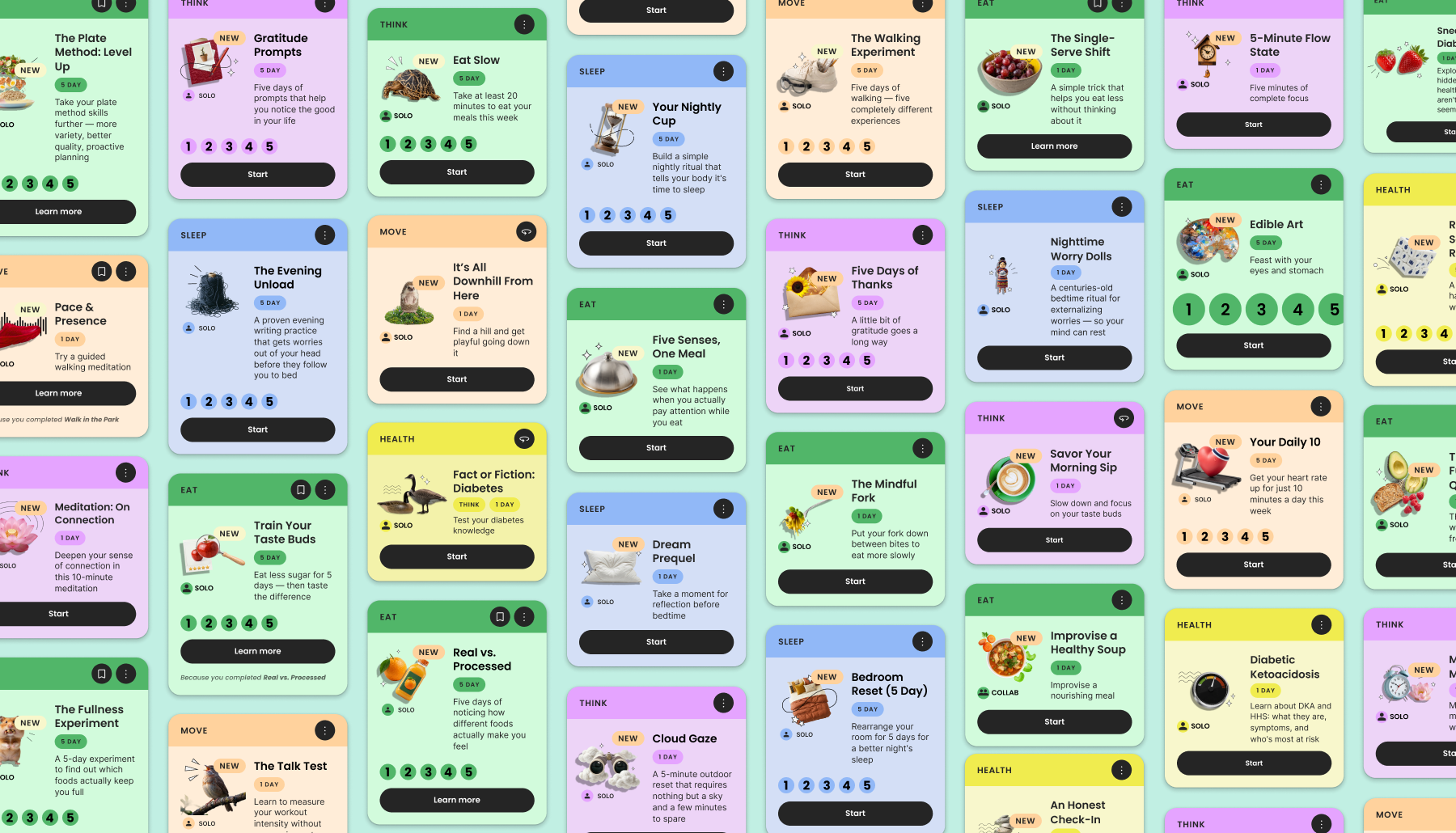
140+ Missions, 600+ illustrations
Overview
Leadership loved the agency's look… but it came with no style guide
Each designer who tried to extend it came back with notes, and illustration became the sticking point in reviews. Even images labeled as placeholders pulled leadership's attention away from the flows.
My role
I designed Missions, the most illustrated part of the app
Missions are small, doable activities, each a step toward a user's health goal, and every one carries a cover image. A Mission couldn't go to dev until it was fully illustrated. To draw them well, I first had to find the rules the agency never wrote down.
Process
I reverse-engineered the look from what leadership approved and what it sent back
I studied everything the agency delivered and every attempt other designers had made to work out what leadership was actually reaching for. Before I even sketched out the rules, I already had a feel for it.
There was a sense of play, humor, jauntiness. Leadership disliked anything too literal and loved a visual turn of phrase. Images were captured from above, lit straight on, in vibrant color that never looked fried. They didn't want hand drawn and they didn't want sterile.
What the agency handed over
How I extended it
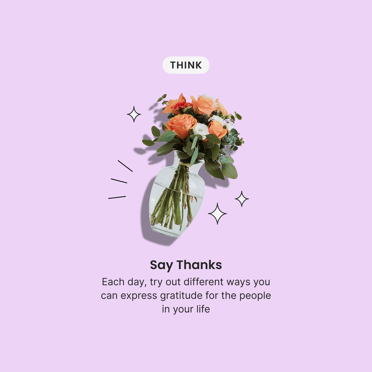
Symbolism
Flowers for gratitude. Tale as old as time.
Vector elements
Another kind of visual styling to add flair without distraction
Dynamic
Tilted at an angle for maximum jauntiness
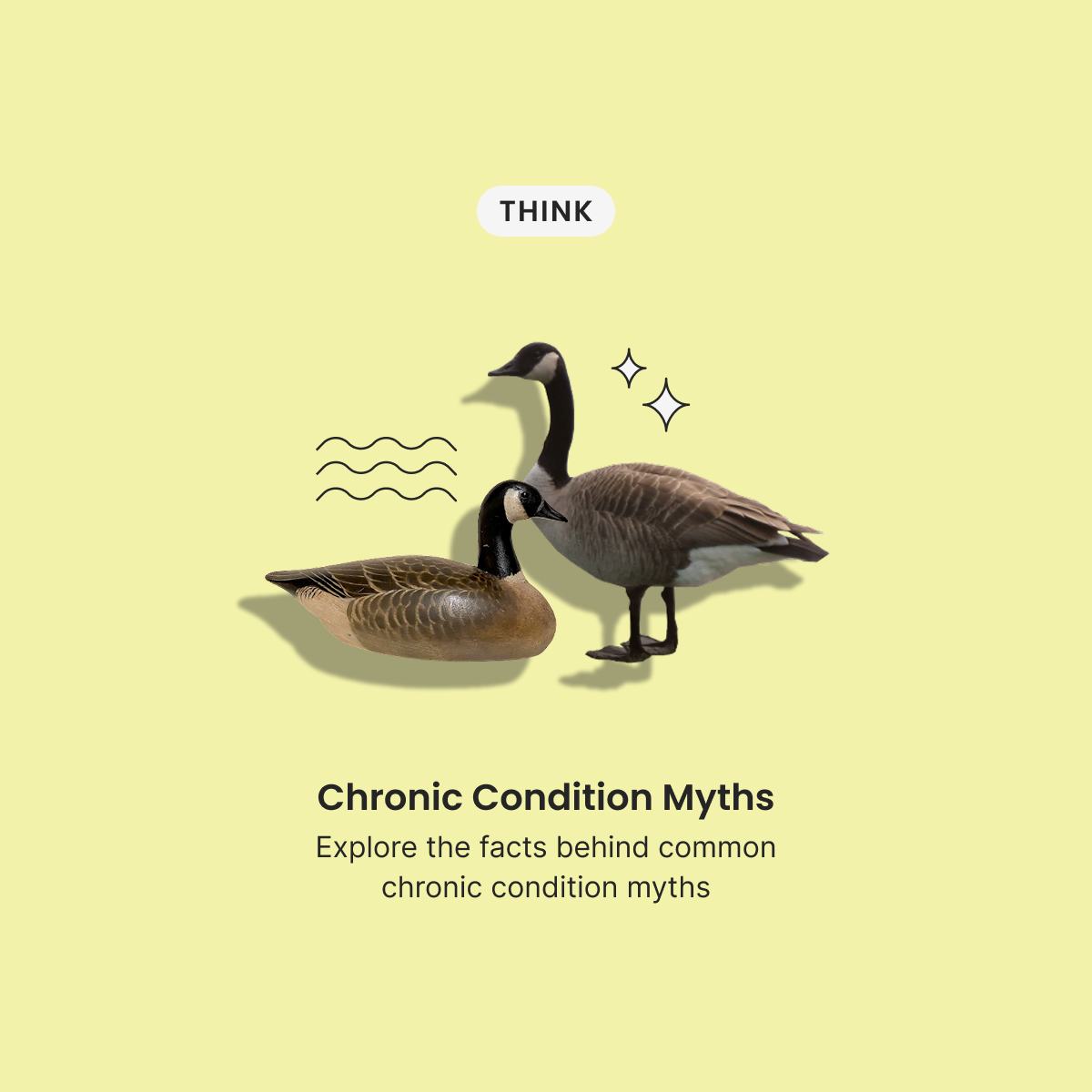
Vector elements
To convey uncertainty around the decoy.
Literal
Literal with a twist. What is 'true' and what merely seems true.
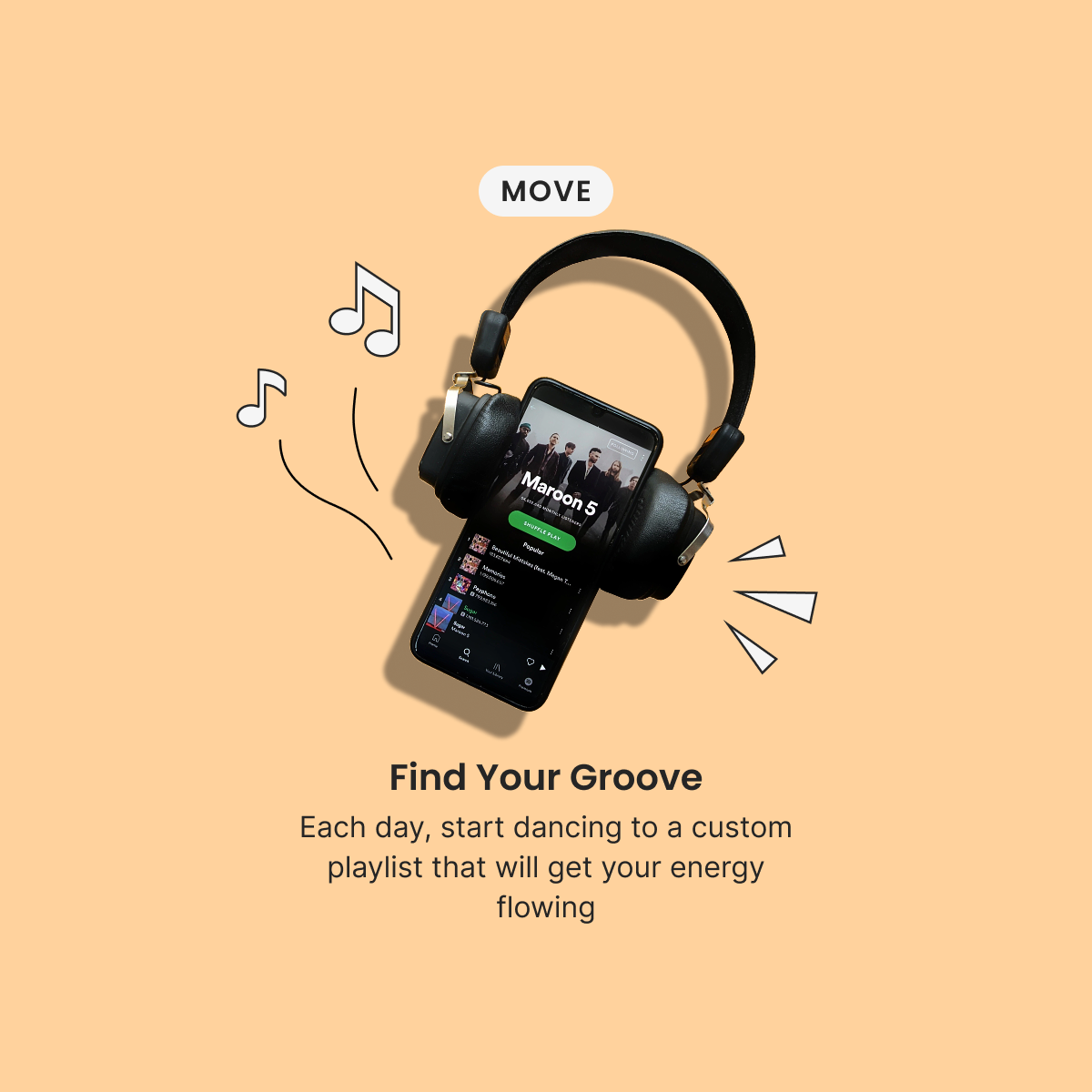
Symbolism
Vector elements can be symbolic as well as emotional
Vector elements
Conveys emotion and energy
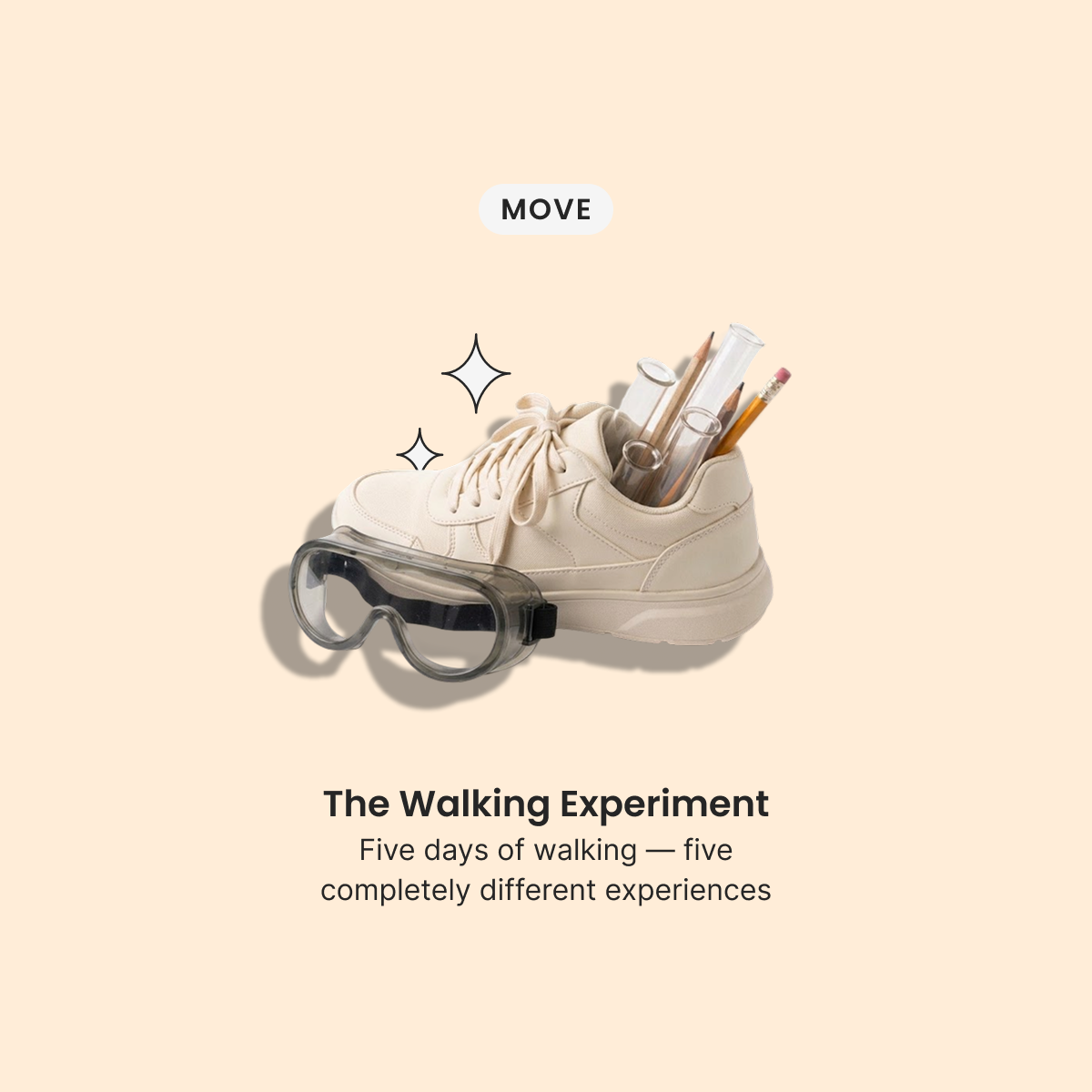
Literal
Another playful twist. Generic shoes for walking.
Symbolism
Test tubes and pencils to stand in for the 'experiment.'
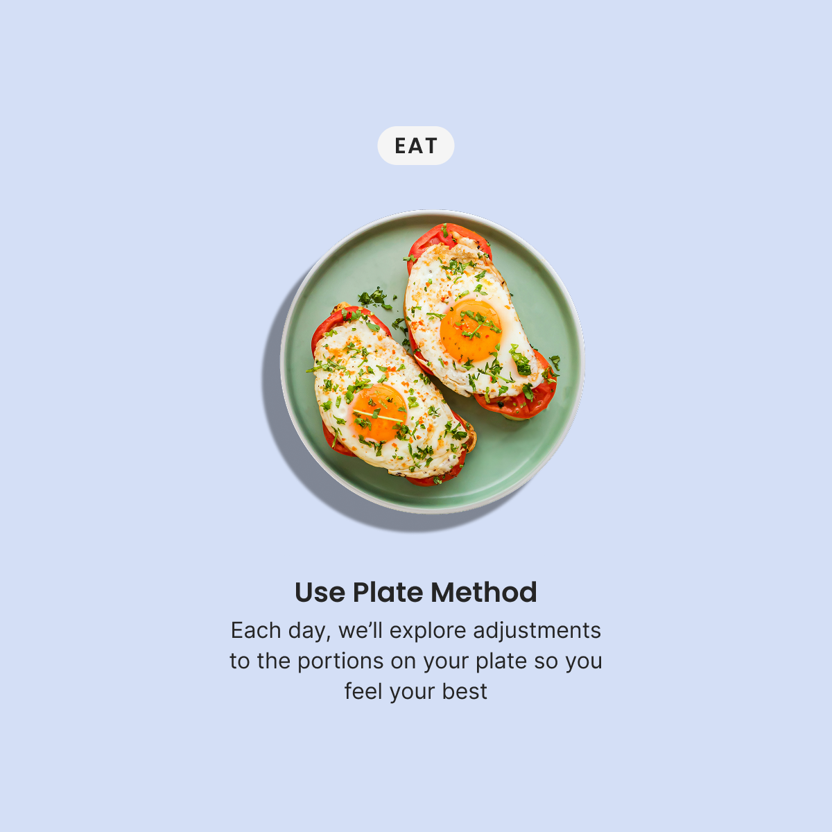
Vibrant color
Subject lit straight on
Drop shadow
Cutout drop shadow as a stylistic choice
Literal
Good example of a healthy portion
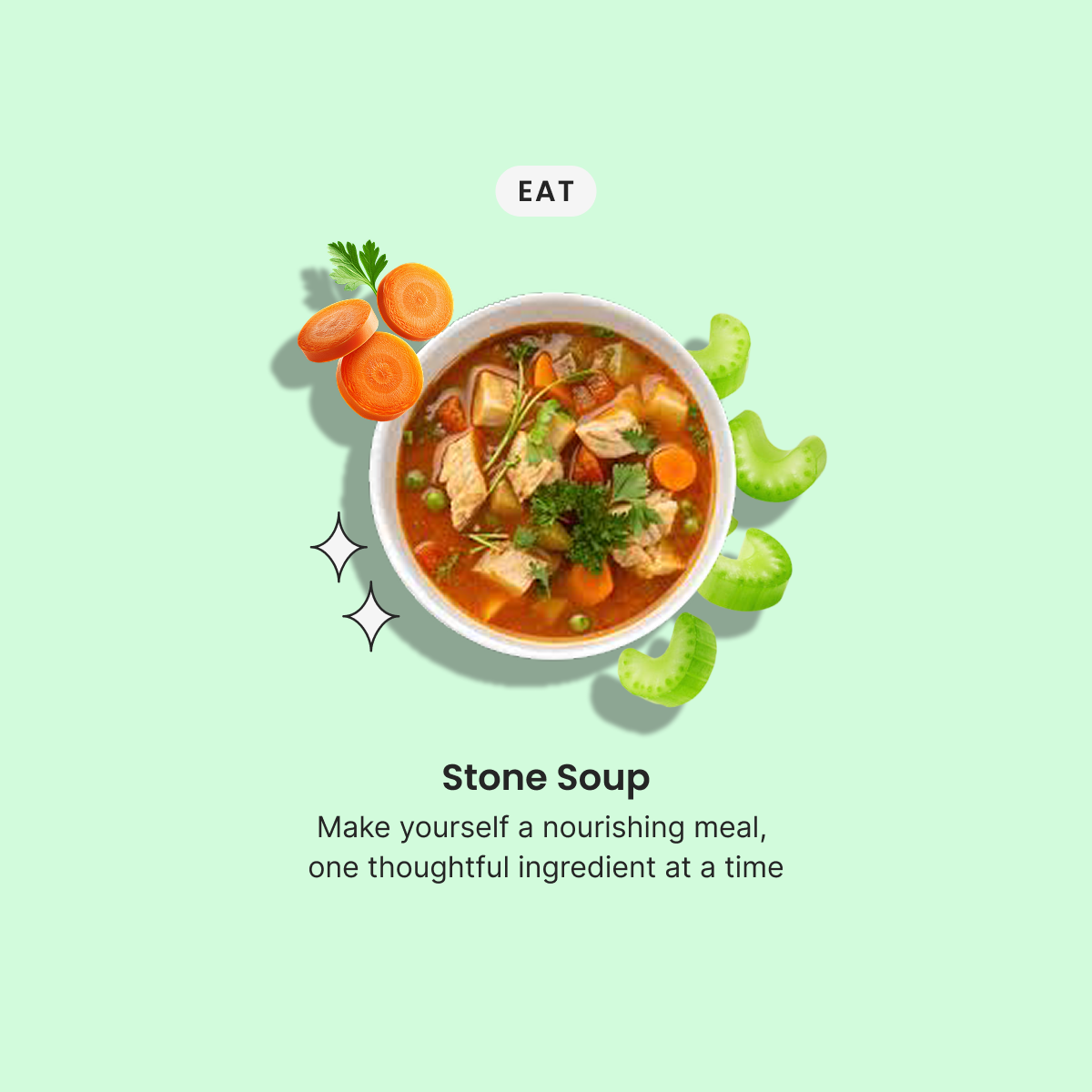
Dynamic
A sense of motion to create visual interest
Literal
Allows the user to quickly understand what this mission is about
Solution
Then I wrote it down as a guide the team could draw to
The guide covers five things: the purpose of illustration, tone and mood, visual language, how to develop a concept, and do's and don'ts.
Tone
Tone was what kept getting picked apart in reviews, so the guide spells it out:
When possible:
- Playful, not childish
- Insightful, not academic
- Warm, not saccharine
- Conceptually clever, not punny for pun's sake
- Grounded in realism, but with an imaginative twist
Method
And a method anyone on the team could repeat:
- Read the mission content to identify the emotional or conceptual core (e.g., rest, curiosity, energy, discovery).
- Brainstorm simple, symbolic objects that represent that theme.
- Introduce a small twist, pairing, or visual metaphor to make it engaging.
- Keep compositions minimal: 1–3 key objects with room to breathe.
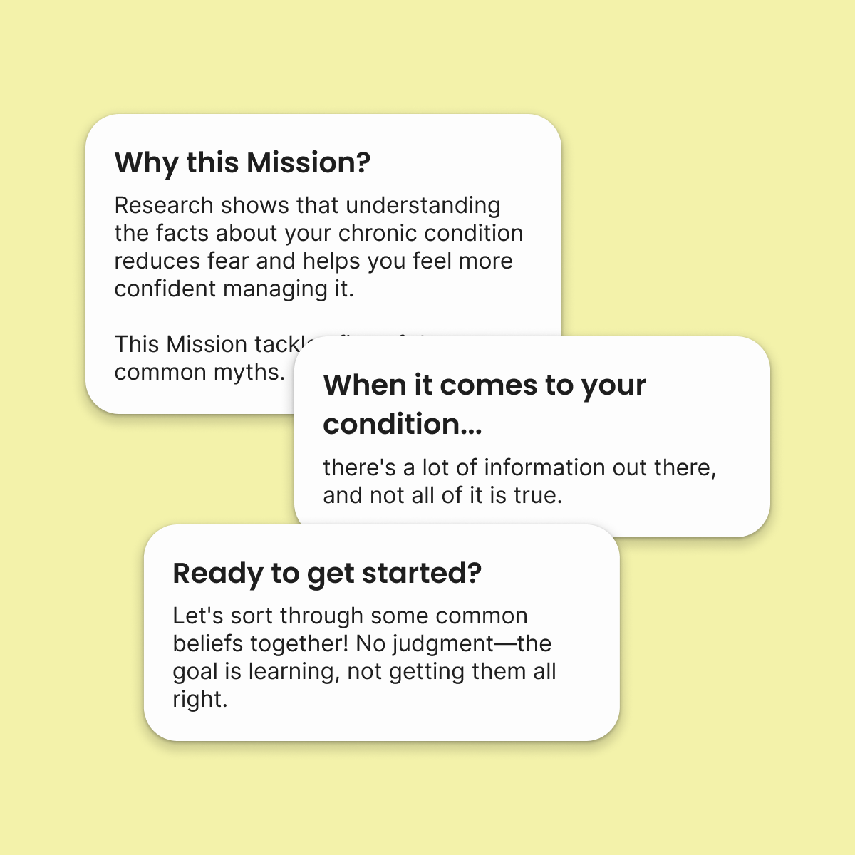
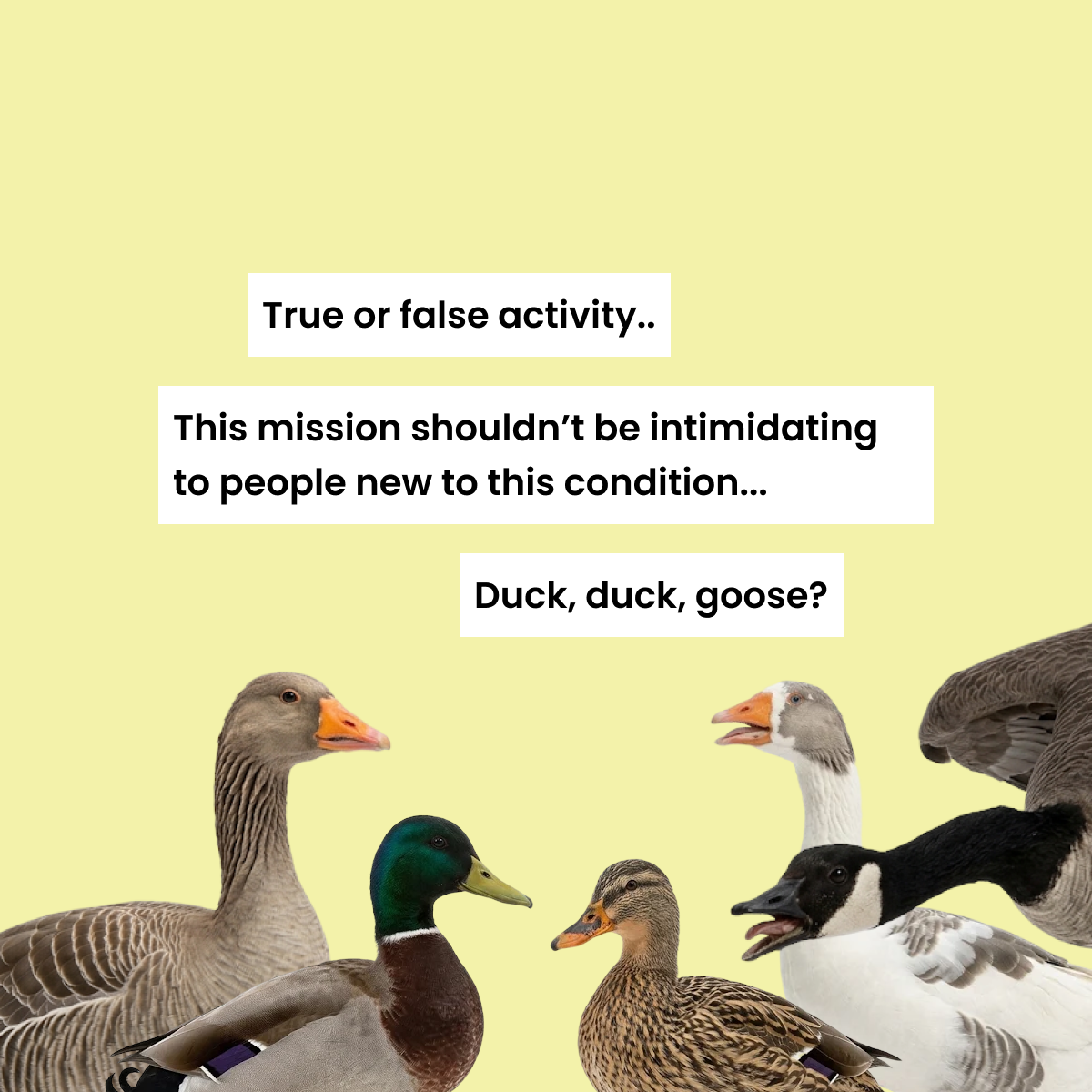
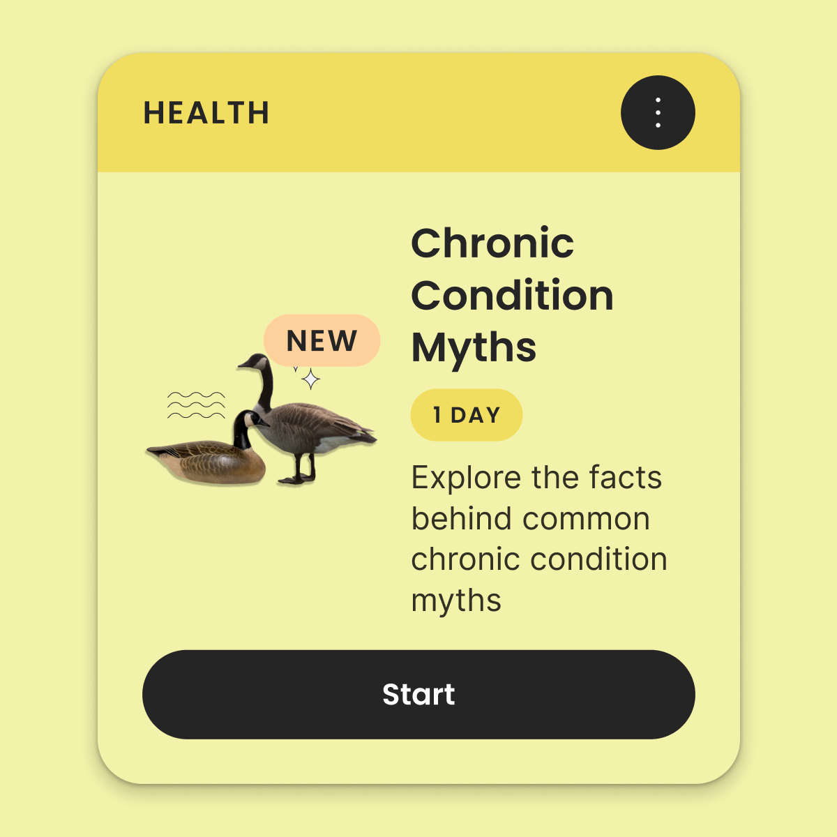
Chronic Condition Myths, from brief to shipped card
When to break the rules
Some mission screens carry a lot more text, so the guide leaves room for judgement:
"If the content for Mission Info seems longer or drier, rules can and should be broken (but use your discretion)"
Motion
The standard grew into motion
I set the easing and timing for the app's motion. Other designers copy those settings straight out of my files, so the whole app moves the same way. Motion is also what won over the head of the org, and I now present a working prototype in every design meeting.
Outcome
Illustration stopped being the problem in design reviews
A Mission couldn't reach dev without its illustration, and for eight months every one ran through me. Writing down what leadership couldn't name turned that into something a team could share: I scaled the standard to three designers, each starting with the guide and a single mission we reviewed together in Figma. Over 140 Missions have now been illustrated to the standard, and designers pull from a shared library of more than 600 illustrations and feel safe in reviews. Leadership recognizes my work without being told, and asks me to carry the same quality across the rest of the app.
Reflection
What I learned
Vague feedback is still feedback
Leadership could react to an image instantly but struggled to describe what they were after, and the words they reached for or pushed away carried baggage. “Quirky” and “not your average healthcare app” were considered distasteful even when they named the correct feeling. I stopped relying on the description and worked from what brought genuine smiles to leadership (and devs’) faces in hand-off, and what was sent back or critiqued, until the rules matched what they’d been picturing all along.
A written standard is great; a live layer empowers the designer
The guidelines gave new designers a starting point, but most of the learning happened in critique, a habit I brought from art school. Each new designer got the guide and one mission to illustrate, working live with me in Figma or bringing it back to review. Seeing their process let me give notes the guide couldn’t capture, and gave them room to ask the small questions they’d otherwise have kept to themselves.
Next case study
Impossible Intents