CanWe
Designing an app that gets two people to look up from it
Company
CanWe
Role
Product design, motion
Timeline
2021 – 2022
Team
Only product designer
Collaborators
UX research, UX design, engineering
Status
Shipped
Overview
CanWe picked up where dating apps leave off
Plenty of apps help you find someone. Very few guide you through what comes after. CanWe helped people work through the topics that matter, intentions first: each person filled out surveys about their dating intentions and interests, then used the app to vet compatibility before going on a date.
Its main feature was the Together Experience: two phones, side by side, revealing each person's answers in a way that protects their privacy and agency. An MVP had shipped, but as more content was added, the app outgrew it.
My role
I balanced what people needed with what we could build
As the only product designer, I worked closely with our UX researcher and UX designer on the Together Experience, and with the dev team to balance our business constraints against our technical ones.
Problem
An app built for conversation, and nobody was talking
In our first designs, people went straight into the survey they'd picked. In user testing, we found they weren't talking to their dates while they went through it.
The new version had to give people enough agency to make it meaningful, start with what they agree on to build psychological safety, protect their privacy while still leaving room for vulnerability, and prompt them to actually talk about what they were looking at.
Process
Every screen hands the conversation back to the people
Only together, in person
Early dating is sensitive, so the experience only starts when two people scan each other's QR code. It's only available when they're, well, together.
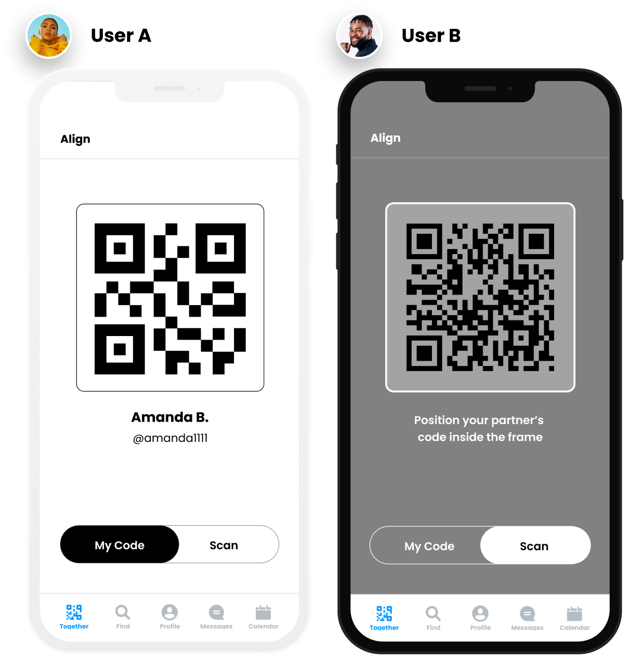
Lighter topics first
Each person chooses which topics and intentions they're willing to discuss. Intentions can get intense, so we lead with topics, which are lighter but still relevant to an early date.
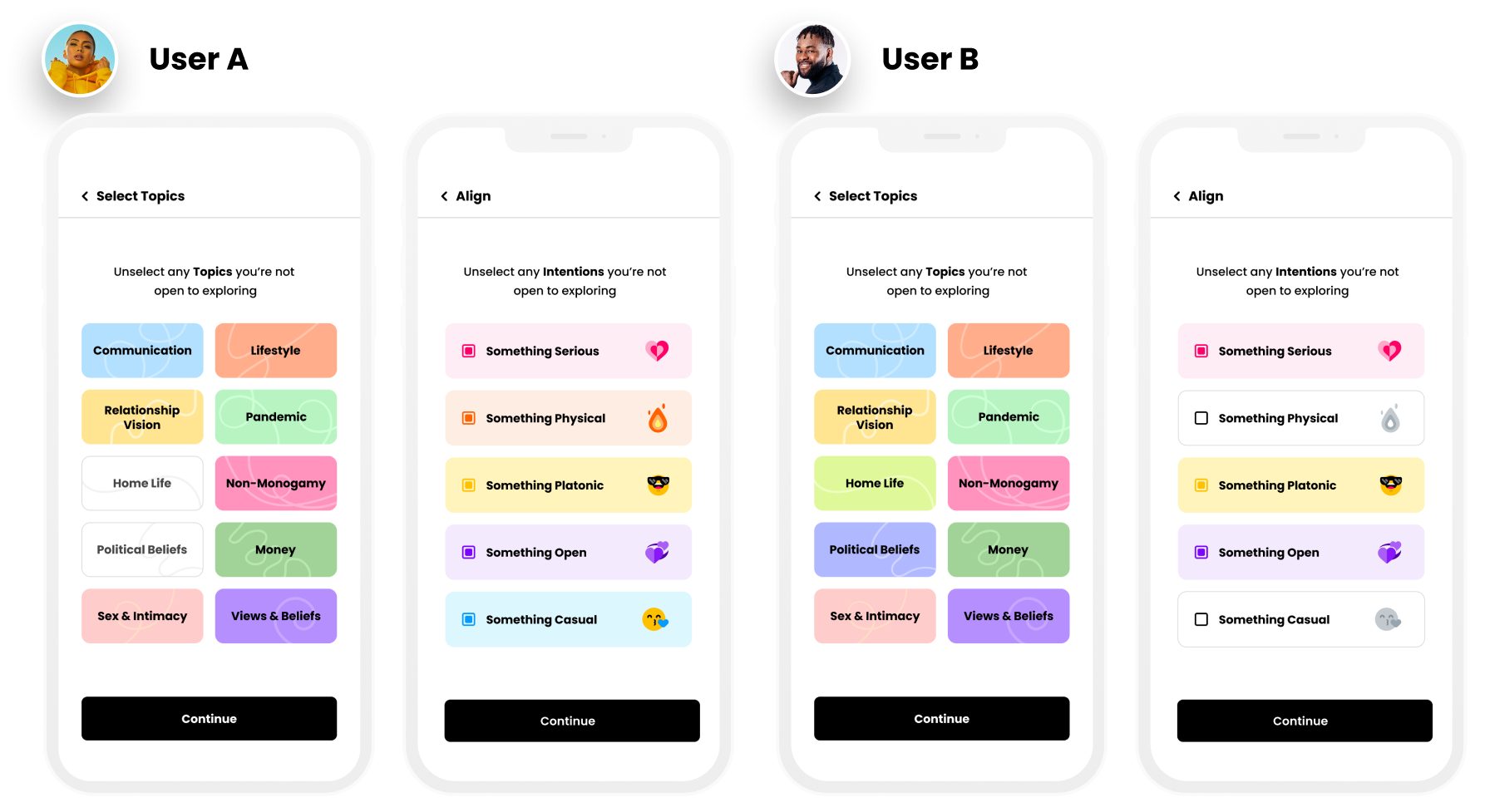
Taking turns
Turn-taking makes sure one person doesn't drive the whole experience. One person picks a card and both answers are revealed, then the other person picks the next.
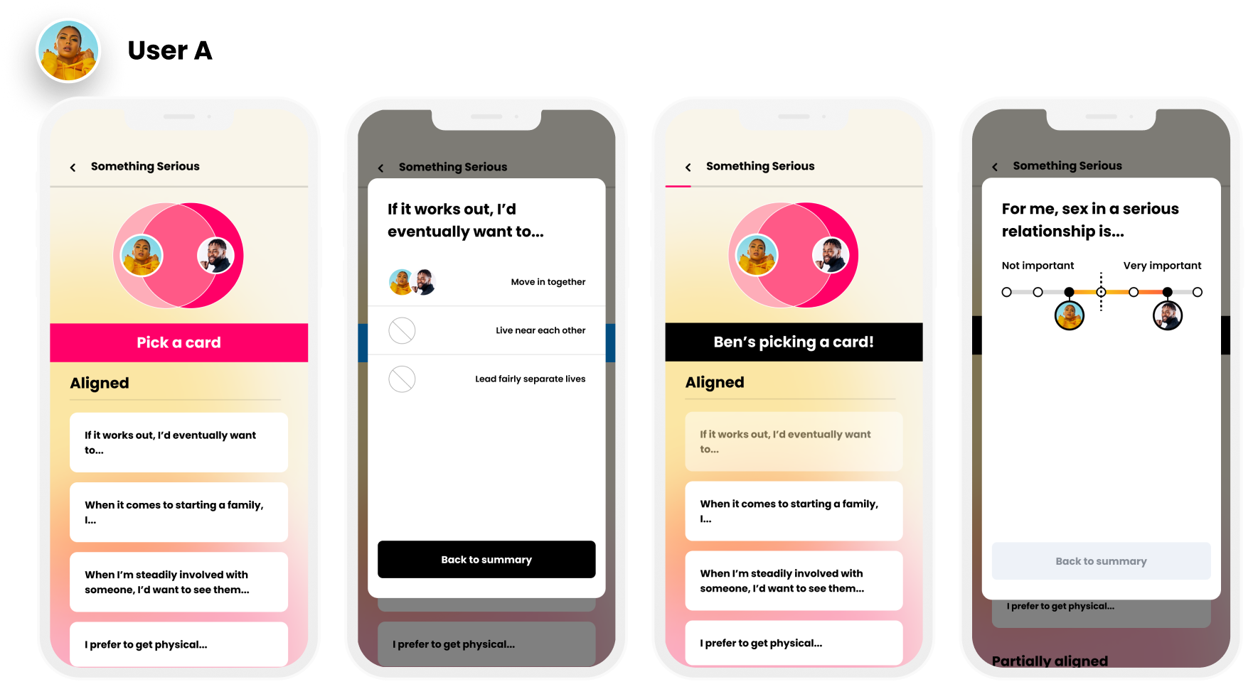
Decision: no deal breakers, so the order does the work
The MVP made people answer every question in order, and users told us they'd rather go straight to what mattered most to them. Our first redesign let them mark questions as deal breakers ahead of time, but the dev team couldn't build that for the first iteration.
Instead, we laid out every question as aligned, partially aligned, then misaligned. People build psychological safety on their similarities first, and choose what to reveal. In interviews, most said they liked having the choice, and that they understood a partner better from which questions they picked.
Iteration
Four of five testers skipped this screen, until it moved
To get people talking, we gave each person a role in the open-ended questions that start every topic and intention: one asks, one listens. In our first round of testing these screens were static, and 4 out of 5 testers tapped straight through without reading them.
For the second round, I animated the text in bit by bit before offering the "Ready!" button, and we rewrote the copy and changed the illustration based on what testers told us. All five testers paused to read it, and asked about it.
Round one: 4 of 5 skipped it
Round two: 5 of 5 stopped to read
Outcome
People slowed down and talked to each other
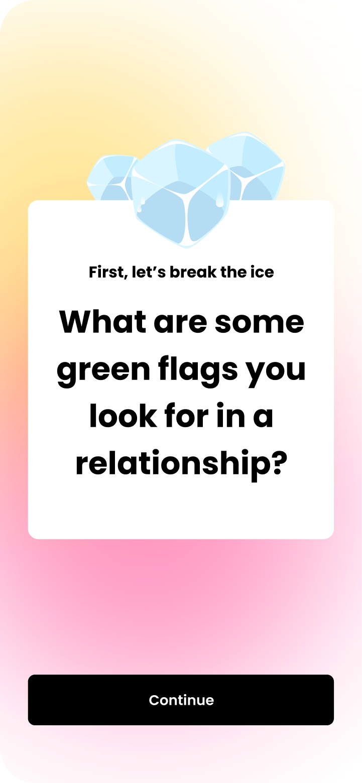
In moderated testing, most people enjoyed deciding what mattered through choice, and got through it faster by only looking at what they or their date cared about. The animated moments, like the ice breakers and the closing reflection, drew more than a few "ooh"s and "ahh"s, and slowed people down to use the app the way we intended.
The redesign shipped, and it led to more engaged conversations between two people working out whether they're on the right date with the right person.
Reflection
What I learned
Human eyes track movement
A screen four out of five people skipped, all five stopped to read once it moved. Motion is one of the clearest ways to tell someone where to look, and when.
Openness can't come at the cost of comfort
We wanted clear, open communication, but people only open up when they feel safe and in control. Priming them for a vulnerable conversation was often a matter of levity and connection: an ice breaker, or starting with what they agree on. And if they stay to the end, we owe them a respectful close, so the experience winds down with an open-ended reflection question, the same way open-ended questions start it.
Next case study
The Mission System