The Mission System
One three-act structure and a kit of reusable modules, built so a digital health app could make around six hundred missions without six hundred separate designs
Company
Global biopharma company
Role
Product design, systems design
Timeline
2025 – present
Collaborators
Behavioral science, UX research, copywriting
Scale
About 55 modules across 3 acts
Status
In development
Overview
The app needed six hundred missions… and not one had been built
Missions are opt-in activities that help people manage their symptoms and their condition. They come in every shape: meditations, videos, lessons, fact-or-fiction quizzes, checklists, a module for gathering questions to ask your doctor, a map and step tracker that nudges you to walk after a meal and more.
They had to stay interesting across a wide range of goals and levels of knowledge, and not every mission would apply to everyone. The program needed around six hundred of them. When I started, not a single one existed, and there was no proof of concept to build from. The whole system grew out of a dream: leadership's vague impression of what should exist.
My role
Our team needed structure before we could build anything
Six hundred bespoke missions was impossible, even for a team consisting of a behavioral scientist, a UX researcher, a copywriter and me, the product designer. We were still working out what a mission could even be. The possibilities were dizzying, and so the UX researcher and I teamed up to design the structure: the base parts every mission is assembled from, and the rules for putting them together. I designed the flows and the module library, which runs on its own design system.
Process
I built three simple missions and picked them apart
I started with the most basic mission I could design: a learning mission, one day of reading about your chronic condition. The second was a true-or-false quiz. The third was a stroll mission.
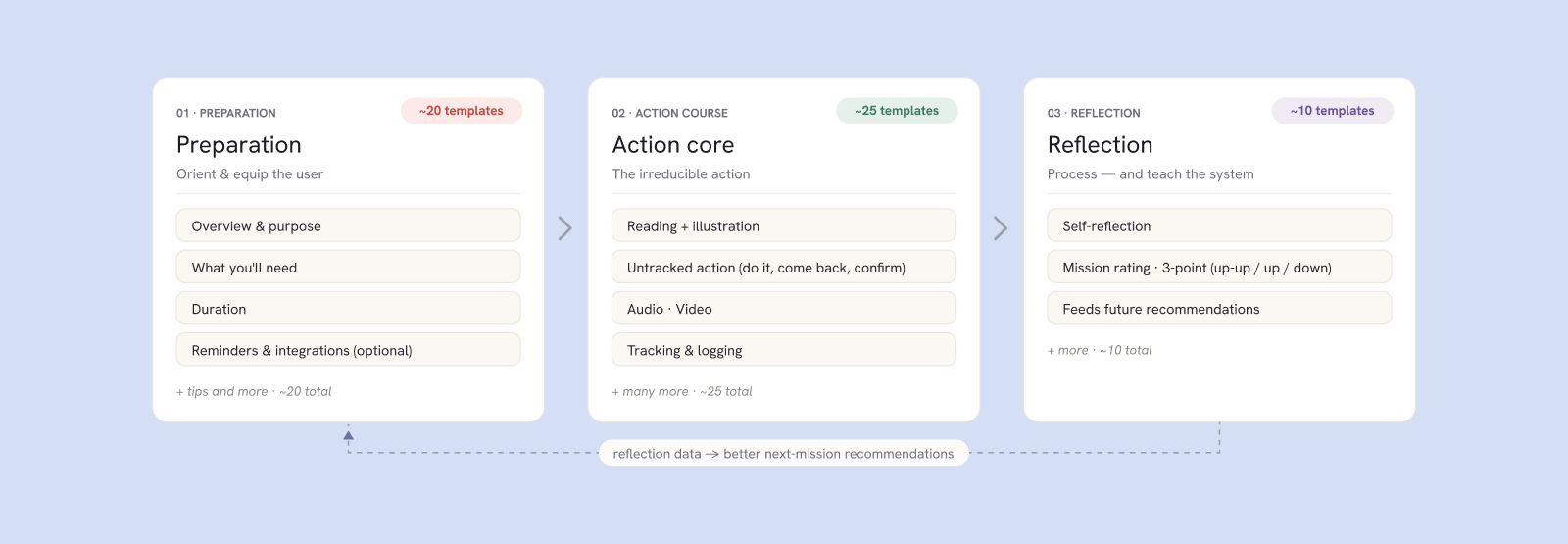
Picking those flows apart, we found they all shared the same shape. Each one had to prepare the person, each had a moment of action, and each came back afterwards to invite an optional reflection on the mission or what they'd learned, along with feedback on whether they enjoyed it.
Decision: one day or five, nothing in between
Mission length was one more variable the system had to absorb. We could have offered one, three and five days, but every length multiplies the templates: a one-, three- and five-day version of every walk, lesson and meditation is far more to build than just one and five. It would also give people one more thing to decide. With two options the choice is simple.
Solution
Every mission shares one three-act spine
Preparation, action, reflection. Each act holds a kit of swappable modules, and a module only appears when the mission needs it. A walk needs step tracking and a reminder; a reading needs neither. A new mission is assembled from parts, not drawn from scratch.
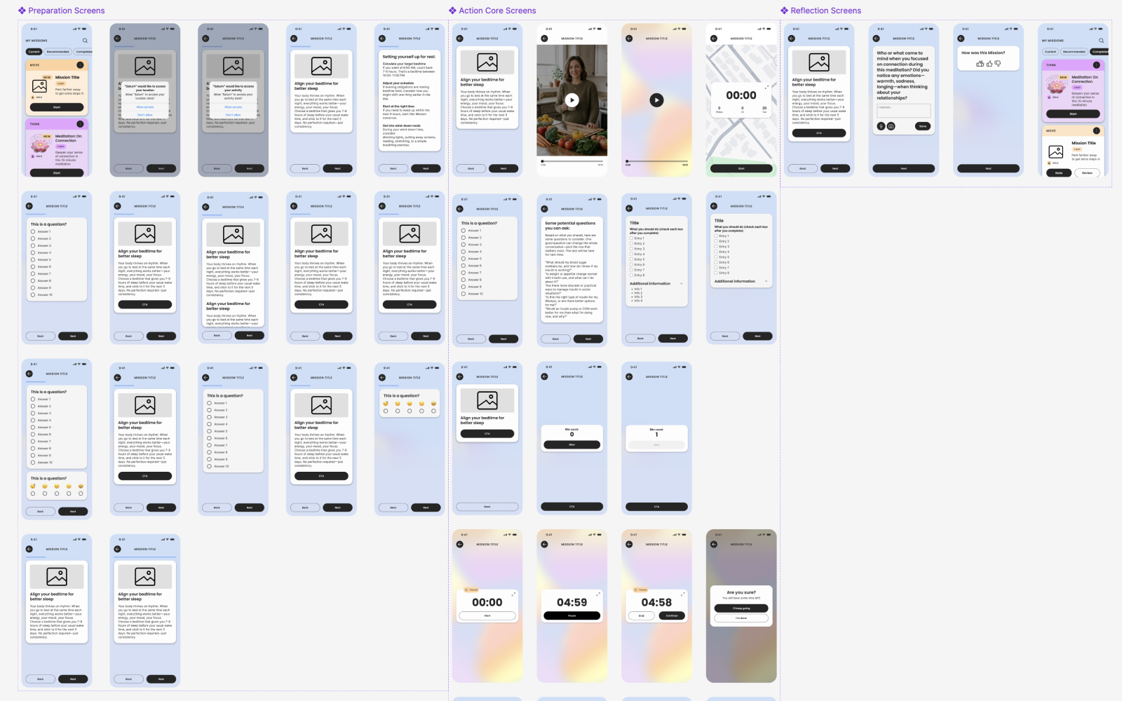
One mission
The Evening Unload, from first screen to last
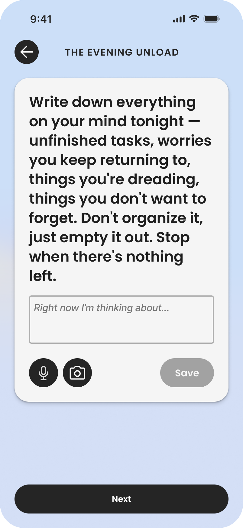
A proven evening writing practice that gets worries out of your head before they follow you to bed.
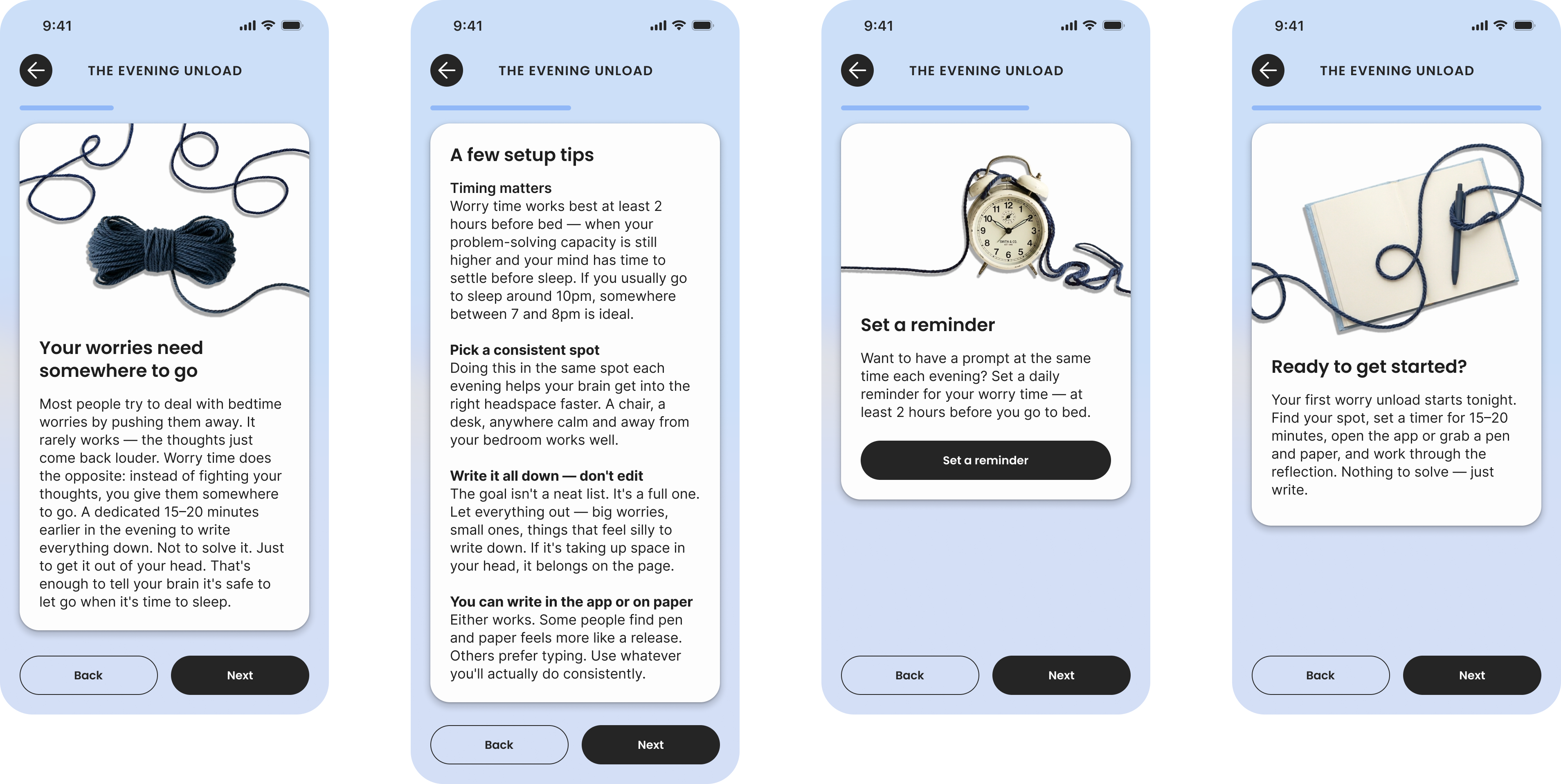
Preparation
Action
Reflection
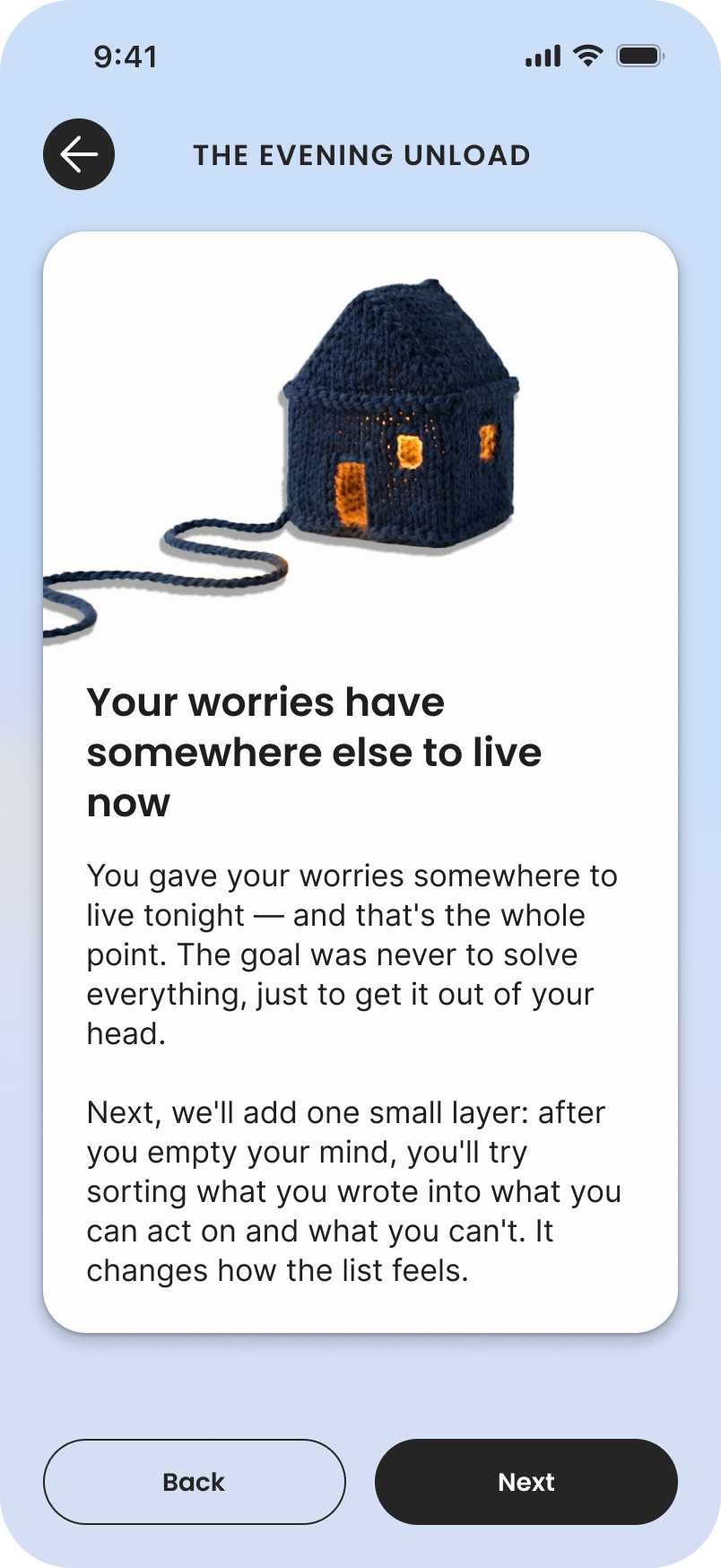
Day 1
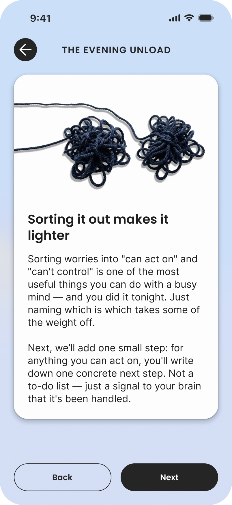
Day 2
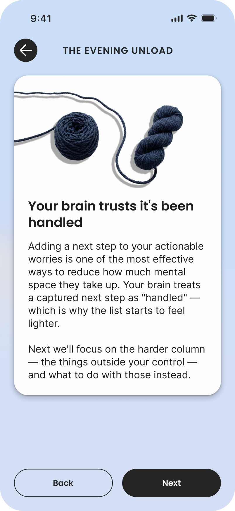
Day 3
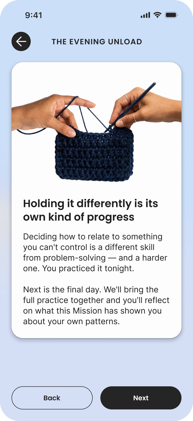
Day 4
Day 5
I broke my own style guide on purpose
Worries feel tangled and pop up where you don't want them. The style guide I wrote discourages full-bleed images, but I leaned into them here to get at how overwhelming worry can be. The yarn runs through almost every preparation screen, then winds its way into each day's reflection in a new form.
Most missions needed animation before leadership got excited. This one won them over with the story the yarn tells.
Outcome
A new mission is a set of choices, not a new design
Four months in, the app had gone from about twenty missions to two hundred, on the way to six hundred. The library now runs about fifty-five modules across the three acts. Reflection closes the loop: people will rate a mission, and that rating will shape what gets recommended next. New module types, like AI chat, medication tracking and mood logging, slot into the right act without disturbing the spine.
It's the quiet part of the work: the spine that keeps missions consistent and accountable, so content creation could happen at all.
Reflection
What I learned
The first mark is the hardest one
Nothing is worse than a blank canvas. Once the first rough mission existed, the team had something to react to, and rules could be drafted, broken and rewritten until they fit, with research testing every version.
Comparison is the best test of a rule
A rule only proves itself next to something else. Putting three missions side by side showed what they shared, and that's what turned three designs into a structure.
Next case study
House Rules